Topic: DMD0230
The Do-more Designer Programming Environment
The default layout of the Do-more Designer Programming software main screen is divided into the following main areas (numbered 1 through 4 in the picture below):
1 - The Toolbar Section - traditionally at the top and right edge of the screen, the location where the system and user toolbars will be placed
2 - The Utility Pane - along the left edge, the location where the runtime helper views will be placed
3 - The Tabbed Ladder Views - most of the center the screen, contains the Start Page and a tabbed view for each open code-block
4 - The Status Bar - along the bottom edge of the main window, contains information about the current programming session
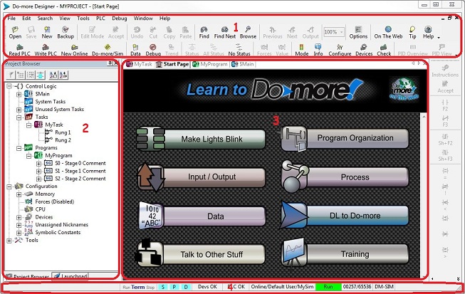
1 - The Toolbar Section
This section will display all of the enabled toolbars. Toolbars can be quickly enabled and disabled through the View -> Toolbars menu selection or right-clicking in the toolbar section. The default placement of the toolbars is along to the top and right sides of the programming window, but any toolbar can be 'docked' along any of the four sides by left-clicking on the bar at the far right end on the toolbar and dragging it to the desired edge until it 'snaps' onto that edge. Toolbars can also be floated completely outside the borders of the Do-more Designer application window,
The following are all of the built-in toolbars in their default configuration. The functions of each icon are list from left to right:
The Offline Bar

Open - opens an existing project
Save - saves the currently open project to disk
New - creates a new offline project
Backup - creates a backup copy of the currently open project
Edit Mode - toggles the ability to change the contents of code-blocks
Accept - checks all changes made to code-blocks for correctness
Undo - leaves Edit Mode then opens Edit History to revert to previous versions of code-blocks
Cut - removes the currently selected rungs from the code-blocks and places the rungs in the clipboard
Copy - places a copy of the currently selected rungs in the clipboard
Paste - copies the contents of the clipboard to the current code-block
Find - opens the Find Element or Instruction dialog
Find Next - repeats the previous Find operation
Browse - opens the Element Browser
Previous - go to the previous cross-reference location of the element under the field cursor
Next - go to the next cross-reference location of the element under the edit cursor
Output - go to the next cross-reference location of the element under the edit cursor used as an output
Zoom - change the zoom level of the current Ladder View
Options - opens the Options dialog for the current context
On the Web - opens a web browser to display the 'Do-more on the Web' page
Tip - invokes Tip of the Day
Help - opens the Help topic for the current window
The Online Bar

Read PLC - uploads the contents of the currently connected Do-more controller
Write PLC - downloads the current version of the project to the Do-more controller
New Online - opens the Online dialog to establish a new online programming session
Do-more SIM - runs Do-more Simulator
Data - opens a new, empty Data View
Debug - opens the Debug View dialog
Trend - opens a new, empty Trend View
Status - enables status for the current view
All Status - enables status for all open views
No Status - disables status for all open views
Forces=! - opens the Configure Forces dialog
Value=? - opens the Change Value dialog
Mode - opens the Set PLC Mode dialog
Info - opens the System Information dialog
Configure - opens the System Configuration dialog
Devices - opens the Device List view
Check - runs the Program Check rules against the contents of the code-blocks
PID Overview - opens the PID Overview
PID View - opens the PID View
The Ladder Bar

Instructions - opens the Instruction Palette
Accept - checks all changes made to code-blocks for correctness
F2 - places a Normally Open contact in the current edit cursor location and opens the contact editor
F3 - places a Normally Closed contact in the current edit cursor location and opens the contact editor
Sh-F2 - places a Rising Edge contact in the current edit cursor location and opens the contact editor
Sh-F3 - places a Falling Edge contact in the current edit cursor location and opens the contact editor
= - places an Equal contact in the current edit cursor location and opens the contact editor
! - places a Not Equal contact in the current edit cursor location and opens the contact editor
< - places a Less Than contact in the current edit cursor location and opens the contact editor
n/a - places a Less Than or Equal contact in the current edit cursor location and opens the contact editor
n/a - places a Greater Than contact in the current edit cursor location and opens the contact editor
> - places a Greater Than or Equal contact in the current edit cursor location and opens the contact editor
Delta - places a Delta contact in the current edit cursor location and opens the contact editor
Out - places an OUT coil in the output column and opens the coil editor
Set - places a SET coil in the output column and opens the coil editor
Reset - places a RST coil in the output column and opens the coil editor
Browse - opens the Element Browser
Ctrl-w - draws a horizontal wire from the current edit cursor location to the output column
Edit Mode - toggles the ability to change the contents of code-blocks
The File Bar

Close - closes the currently project
Save As - saves the currently open project to a new filename, then opens the new project
Restore - opens the Restore From Backup dialog
Folders - opens the Folder Settings dialog
Import - opens the Import Project dialog
Import Doc - opens the Import Element Documentation dialog
Export - opens the Export Project dialog
Export Doc - opens the Export Element Documentation dialog
Preview - opens the Print Preview dialog for the current view
Print - opens the Print dialog to print the current code-block
Print All - opens the Print All dialog to select one or more project items to print
Print Setup - opens the Printer Setup dialog
Properties - opens the Project Properties dialog
Exit - closes the currently open project
The Edit Bar

Undo - opens Edit History to revert to previous versions of code-blocks
Edit Hist. - leaves Edit Mode then opens Edit History to revert to previous versions of code-blocks
Cut - removes the currently selected rungs from the code-blocks and places the rungs in the clipboard
Copy - places a copy of the currently selected rungs in the clipboard
Paste - copies the contents of the clipboard to the current code-block
Delete - removes the element under the edit cursor or the currently selected rungs from the code-blocks
Insert - opens the Insert dialog
Merge Prev. - Merges the current rung and the previous rung into a single rung
Merge Next. - Merges the current rung and the next rung into a single rung
Contacts - opens the Instruction Browser on the Contacts tab
Coils - opens the Instruction Browser on the Coils tab
Boxes - opens the Instruction Browser on the Boxes tab
Instructions - opens the Instruction Palette
The Search Bar

Replace - opens the Search and Replace dialog
Next Mod. - moves the edit cursor to the next modified (but not Accepted) rung
Prev Mod. - moves the edit cursor to the previous modified (but not Accepted) rung
Goto - opens the Go To Address or Rung Number dialog
The View Bar

Start Page - toggles the display of the Start Page
Launchpad - toggles the display of the Launchpad
Project Browser - toggles the display of the Project Browser
Ladder View - will open a Ladder View for $Main
Customize - opens the Customize Menus and Toolbars dialog
Themes - opens the Select Visual Theme dialog
Colors - opens the Color Setup dialog
Zoom In - changes the zoom level of the current Ladder View to the next larger zoom factor
Zoom Out - changes the zoom level of the current Ladder View to the next smaller zoom factor
The Tools Bar

Documentation - opens the Documentation Editor for the current element
Nicknames - opens the Assign Nicknames dialog
Comment - opens the Rung Comment editor for the current rung
Title - opens the Title Page Editor
Memory Mgr - opens the Memory Image Manager
Attach - opens the Attach User Document dialog
DNS - opens the IP Address Lookup dialog
Compare - opens the Compare Programs dialog
Insert Instructions - opens the Insert Instructions from a File dialog
The PLC Bar

Connect - opens the Select Link dialog to choose an existing communication link or create a new one
Disconnect - closes the current online session, but leaves the project open in Do-more Designer
Session - reopens the current online session
Link Info - opens the Link Info dialog
Configure - opens the System Configuration dialog
Memory - opens the System Configuration dialog on the Memory Configuration page
Clock - opens the Set PLC Clock dialog to manually set the PLC's real time clock
Password - opens the System Security dialog
Clear PLC - opens the Clear PLC Memory dialog
Do-more/SIM - the Do-more Simulator
The Debug Bar

All Status - enables status for all open views
No Status - disables status for all open views
Open Data - opens an existing Data View
Close Data - closes the currently selected Data View
Save Data - saves the contents of the currently selected Data View to its file
Save Data As - saves the contents of the currently selected Data View to a new file
Open Trend - opens an existing Trend View file
Close Trend - closes the currently selected Trend View
Save Trend - saves the contents of the currently selected Trend View to its file
Save Trend As - saves the contents of the currently selected Trend View to a new file
DmLogger - opens the Do-more Logger (Network Message Viewer) dialog
The Window Bar

New Window - opens a second instance of the currently selected Ladder View
Cascade - puts the tabbed views in a single stack that has been fanned out so that the titles are visible
Tile Horiz. - (stacked) puts windows in one or more vertical stacks depending on how many windows are open
Tile Vert. - (side by side) opens, but does not maximize, each window so that all of the windows can be seen at once
Arrange - aligns minimized windows along the bottom of the screen
Default - resets the layout of the project's windows back to the default layout
Close All - closes all of the open windows
Output - opens the Output Window
Clear Output - clears the Contents of the Output Window
The Help Bar

Index - opens the Help system on the index page
Start - opens the Help system on the Getting Started page
On the Web - opens a web browser to display the 'Do-more on the Web' page
Tip - invokes Tip of the Day
Updates - opens the Check for Updates dialog
About - opens the About Do-more dialog
Customizing the Menus and Toolbars
 The contents
of the built-in toolbars can be custom configured, and new toolbars can
be created through the View-> Toolbars-> Customize dialog. A check
next to a toolbar will enable that toolbar.
The contents
of the built-in toolbars can be custom configured, and new toolbars can
be created through the View-> Toolbars-> Customize dialog. A check
next to a toolbar will enable that toolbar.
New... - will create a new, empty toolbar (see the section on Commands for adding icons to the toolbar).
Rename - will rename any user-created toolbar
Delete - will delete the selected user-created toolbar
Reset... - will restore the selected toolbars to their default state.
While the Customize dialog is displayed, the icons on any of the toolbar
buttons can be moved to a different position on that toolbar, moved to
a different toolbar, or removed from that toolbar.
To reposition a button on a toolbar - click on that toolbar button and drag it to the desired new location (an I-bar will appear on the toolbar where the command will be placed)
To move a button to another toolbar - click on that button and drag it to the desired new toolbar (an I-bar will appear on the toolbar where the command will be placed)
To remove an icon from a toolbar - click on that icon and drag it to the Customize dialog
 The Commands
tab will list all of the toolbar categories and all of the icons on each
toolbar. Selecting an entry in the Categories: group will display all
of the icons that are currently on that toolbar in the Commands group
- or select the All Commands entry to display an alphabetic list of all
the icons from all of the toolbars.
The Commands
tab will list all of the toolbar categories and all of the icons on each
toolbar. Selecting an entry in the Categories: group will display all
of the icons that are currently on that toolbar in the Commands group
- or select the All Commands entry to display an alphabetic list of all
the icons from all of the toolbars.
To add a command to a toolbar click with the mouse on the desired command and drag that command onto the toolbar - an I-bar will appear on the toolbar where the new command will be placed.
 The options
tab has selections that control the look and feel of the menus, toolbars,
and their buttons.
The options
tab has selections that control the look and feel of the menus, toolbars,
and their buttons.
Personalized Menus and Toolbars
Always show full menus - if checked, the Menu bar items (File, Edit, Search, etc.) will always display all of their available options.
Show Full menus after a short delay - if checked, the Menu items (File, Edit, Search, etc.) will start initially displaying only the most used options, then will display the full menu (without clicking on the double arrow) if the mouse pointer remains on that menu.
Reset menu and toolbar usage data - menu usage data determines which options are displayed on the menus, this button will clear that data
Other
Large Icons - if checked the toolbars will user the large (32x32) icons, if unchecked the toolbar icons will use small (16x16) icons
Show Screen Tips on toolbars - if checked, hovering the mouse cursor over a toolbar icon for 1 second will display a pop-up tooltip for that icon
Show shortcut keys in Screen Tips - if checked, the pop-up tooltip will also contain the keystrokes that will perform that icon's function (if available)
Menu Animations - determines the how
(System Default) - the animation used will be based on the animation that is selected for all Windows menus in the "Display" control panel
Random - each time a menu is opened, an animation will be selected at random from the three that are explained below
Unfold - the menu will appear from the left-hand side of the menu name and will unfold down and to the right until it is fully open
Slide - the menu will appear in its full width, but "rolled up" and will roll straight downward until it is fully open
Fade - the menu will appear fully open but as a "faded out" image. It will fade in until it is fully visible
None - the menu will always appear fully open
2 - The Utility
Pane
The Utility Pane is the default location for the following views. Each
of the views is a floatable
The Launchpad contains individual sections that are collection points for Do-more Designer projects, support applications, and communication links to Do-more controllers.
The Project Browser provides quick navigation to the different areas of a Do-more Designer project.
The Data Views are used to monitor the status of, and optionally change the values of selected memory locations in the Do-more controller. Multiple data views can be open at the same time, each viewing the same or different memory locations, in the same or a different format (Native, Binary, Octal, BCD/ Hex, etc.).
The Debug View is used to manage the runtime debug operations in the Do-more controller.
The PID Overview displays a boilerplate graphic for each Closed Loop Controller (PID) instruction in the project.
3 - The Tabbed Ladder Views
The center programming window is the where the views for the following will be displayed.
The Start Page will display some current information from 'Do-more on the Web', has links to help topics that are made specifically to help the New -to- Do-more programmers get up to speed quickly, and has provisions that allow projects to display a file (called the User Document) in the Start Page.
The tabbed Ladder Views will display the contents of the code-blocks in the project when they are being edited.
All Trend Views will have a separate tab.
All PID Views will have a separate tab.
The Output Window
4 - The Status Bar
At the bottom of the Do-more Designer programming window is the Status Bar which displays information about the current programming session.
The status bar contains the following 10 separate sections - some of which will be visible / invisible depending on the programming operations currently being used:
The left-most section is the Writing To PLC / Writing To ROM section. This section will be empty most of the time but will display two different icons when a Write PLC operation is processed. The first icon displayed is that of a PLC base which indicates the transfer of ladder logic and/or configuration data to the controller is taking place. The second Icon is that of an IC chip which indicates the controller is writing the newly downloaded information to the ROM in the controller (the ROM LED will be ON during this part of the process).
Next is the Current Mode Switch Position section which displays the current position of the Mode Switch located on the front panel of the controller. The current mode will be displayed in BOLD BLUE. Follow this link for a full description of each possible mode.
Next is the Sync Status section which displays whether or not there are differences between the version of the System Configuration, the Program and the Documentation currently displayed in the Programming window and the version stored in the controller, and the version stored on disk.
Next is the Device Status section
which monitors the state of any Devices currently being used.
Next is the Controller Status
section which monitors the runtime state of the controller. Any time
Next is the Session Status / User /
Link Name section which monitors the state of the communication
link between Do-more Designer and the controller. The
Next is the Controller Mode
section which displays the current mode of the controller (
Run
Next is the Memory Usage section which displays how much the available program memory in the controller is being used ( current usage / total available ).
Next is the Controller Type section which displays the Do-more controller type specified in the current project.
Last is the Cursor Position section that tracks the position of the edit cursor ( code-block # rung number : row number : column number )
See Also: